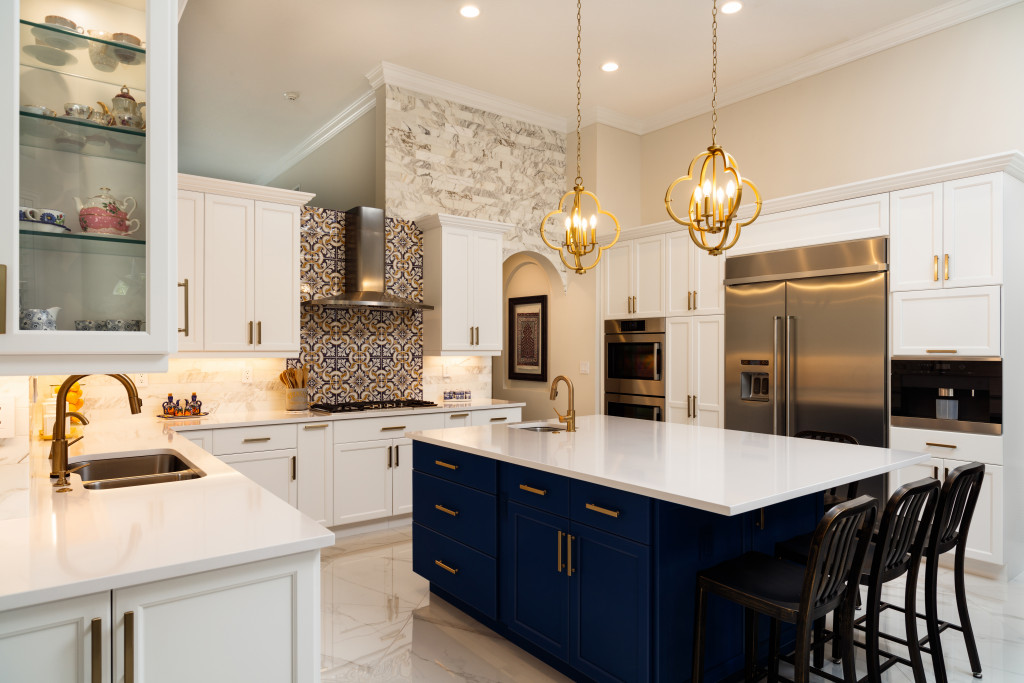
When we watch films by Nancy Meyers, we find ourselves invested in the characters, their relationships with each other, and the stories. But, when we watch her films, we’re also drawn to another aspect: the interior design of the characters’ homes.
Here’s a closer look at the homes in some of her popular movies. They’ll inspire you to employ some traditional, industrial, and other elements to your home design. Who knows? You might even start contacting property agents to get the ball rolling with your own home development.
The Intern (2015)
In this film, Anne Hathaway played Jules Ostin, a young and successful CEO of an e-commerce business selling fashion merchandise. But, when at home, she’s a wife to a stay-at-home dad and a mother to a little girl. Since she’s prominent in the fashion industry, her tastes for design are refined and up-to-date. This was reflected in her home design, a stylish brownstone in the heart of Brooklyn.
Kristi Zea, an Oscar-nominated production designer that worked on this film, applied hints of traditional and modern in Jules’ home. There were mid-century pieces of furniture paired with Moroccan prints on pillows, blankets, and rugs. The kitchen, which is always a centre of activity in Meyers’ films, mixed classic pieces with industrial elements. It’s seen in the kitchen stools made of metal. It’s also seen in the farmhouse sink with pristine white ceramic. There’s also a touch of New York with the subway tiles all over the kitchen walls.
Something’s Gotta Give (2003)
A vacation house by the Atlantic Ocean in the Hamptons is a huge dream for many of us. And it’s exactly what Diane Keaton had in this movie. She played Erica Barry, a well-known playwright who’s on the cusp of writing her next big project. Her beach house embraced classic pieces. Everything’s surrounded by varying shades of white and cream.
The film’s set decorator, Beth Rubino, applied “simplicity and a certain austerity” that’s often seen in houses in the Hamptons. Through the film, she proved that the neutral colours of white, beige, and cream aren’t bland or boring. It’s seen in the couches, the curtains, and even the dishes that are on display in the dining room.
But the kitchen was the real star of the show. It had white walls and cabinets. But all of that white is cut through by black countertops. The whole room was wide, airy, and welcoming. You could tell that it’s the heart of the home.
It’s Complicated (2009)
The kitchen was, yet again, the most notable aspect of the production design in this film. The kitchen belonged to Meryl Streep’s character, Jane. She owned a successful bakery, so it’s no surprise that her kitchen was well-used, beloved, and memorable to the audience. It’s notable for the open cabinets but without the show of clutter. The dishes, kitchen tools, and whatnot are all arranged neatly. The freestanding island was set with a marble countertop, with overhead lights casting a warm yellow glow on it.
The other parts of Jane’s Spanish-style ranch also left quite an impression on the audience. The living room had a lot of earthy colours from rugs, curtains, and blankets. Then, these colours were paired with wooden accents from furniture pieces. All of them came together, making the room warm and inviting—exactly what a family living room should be.
Home Again (2017)
Although this movie was only produced by Meyers, not directed, it still had her touch in it. This was because it’s her daughter, Hallie Meyers-Shyer, who sat on the director’s chair. But the house still left an impression on the audience. The film starred Reese Witherspoon as Alice Kinney, a recently-separated wife who wanted to start a business for interior design.
Her house was more eclectic than the previous movies mentioned. She used rather unusual pieces of decoration. An example was a wall decorated with African belly baskets. It had a lot of rattan all over the place. Indoor plants, especially tropical ones, were also scattered around the house. All of these came together with the wood accents and earthy tones. It made the eclectic elements inviting and fitting for a family.
More often than not, the stories in Meyers’ films are romantic comedies in nature. But they are, without fail, about friends, family, self-discovery, and love, even if it’s not always romantic. These stories come alive in beautiful homes. They always look like they came straight out of Pinterest. Whether it’s a vacation house in the Hamptons or a brownstone in Brooklyn, her houses always have an air of elegance, class, and cosiness. Whatever your plans are for your home’s design, you can always look into Meyers’ films and be inspired.


